BLOGGER TEMPLATES AND TWITTER BACKGROUNDS »

Friday 20 November 2009

Research. (Animation - creepypasta.com.)


I've been reading a lot of scary stories/poems to help me come up with a concept for my animation and digital posters - this is one of those examples. I find reading disturbing and creepy stuff allows my mind to think about idea's I can use or how I would turn the words in to illustration and do them in my own way.

One of the main writers I've been looking in to has been H.P Lovecraft - he's an author who delves in to sanity and the world around us. One of the things he's known for is saying that sane people don't see the world for what it is because anything to disgusting (like monsters/ect,) we have learned to block out and ignore. Only insane people can see these things - which ironically, makes them the sane ones.

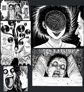
For this project, what I really want to do is show the kind of stuff I want to do - such as surrealism and creepy, shocking images. Thats why I'm going to come up with concepts based around these theories and look in to more writers like H.P Lovecraft, Richard Laymon, Stephen King and Junji Ito.

Research. (Web design -http://www.xperiment.ca/.)


This website is based on drugs use and those effects. It all revolves around an animated eye, which is why it takes up most of the room on the screen. This website uses various methods to convey a message in a way which is interesting and can keep someone entertained. It uses a clean, well thought out layout which uses well animated characters.

The website opens up in a grimy, dark room with the eye ball in the centre and the only focal point. At the bottom, there's commands such as "choose a drug," and "choose an effect." At the top, there's all the main links to access other pages. This website mostly depends on it's ability to entertain and be interactive, because these are it's strongest points. For instance, if you click on "choose a drug," it allows you to choose from a selection of various drugs and actually drag them on to the eye to see their effect - the eye will then demonstrate what happens when you take the substance, such as displaying actions of paranoia and sickness/ect. A voice over describes what's happening, this is so you can watch the full effects of the drug and understand what's happening and not miss anything by having to read text - however, there is a link which takes you to a page where it explains in more detail (and in text) what happens when you take certain drugs if you don't wish to watch the animation and listen to the voice over. In doing this, they allow the viewer to choose from two different ways to learn about drug use, which overall feels more comfortable.

The website is perfect for people looking to learn about drug use. Not only does it use a lot of methods to keep the viewer interested, it also allows the viewer to feel involved by having to click and drag things to activate the animation. The text is also informative and straight to the point and the animation of the eye demonstrating the effects of drugs - even though it is just an eye - is slightly disturbing and well done visually.

This site is, I feel, aimed at teenagers doing drugs - and I think it works well for that age group. It's fresh, it's young and it's shocking so it's bound to leave some kind of impact on the people watching it. Overall, I really like the website and love the way it's animated and its interactions - the only thing I felt it lacked was showing the effects of more drugs, since there's only three to pick from. - With my website I'd like to do something shocking and make some kind of impact, because I feel the end of world is something people take lightly these days.

Research. (Web design - http://www.jasongraymusic.com/.)


This website to promote Jason Gray uses a wide range of materials and methods to come up with something I feel is really creative and interesting. At the beginning, the page opens up on to a main title screen where all the links and small amounts of information is. At the top, there's a half face where images and the text is - this is where you click and navigate. When clicking upon a link, it changes the part below the page to what the link is about - so basically, rather than opening up a new page, it just alters the parts below the focal image.


What attracted me to this page was the various animations it had. For instance, when moving the mouse around the head area, the eyes will follow it's movement - and if you roll over one of the eyes, it will close. Also, when you roll the mouse over one of the images in the head, it shows a small animation inside. Another feature I specifically liked was the background and how it looked like scanned in bits of paper - I thought this added a nice, traditional feel too it and made it seem more "Artistically" themed - it follows this throughout with the text, sketchy drawings and background - which I particularly liked.

The things I didn't like so much was how it didn't open to another page, and just changed the bottom part. After seeing the main page, there isn't that much else to see but bits of text and the odd video - I felt it would have worked better if it had opened up in to new area's with more variety of designs and concepts. What I did like about it, however, is how well it's laid out and how the interactions are. I love the small bits of animation and how the eyes follow the mouse - it makes you feel more apart of the design. I also like the Traditional, artistic look about the theme and how it all works well together. For my design, I'd really like to try some traditional methods such as illustration and small animations.

Research. (Web design -http://www.diegomonetti.com/.)


The main thing which attracted me to this website was how there was a nicely done blend of digital images and actual film. It begins with an animation of the wall opening up like a sliding door, which creates an entrance for the artist himself. If you choose to click on one of the links, it will take you to another part of the website and the film animation of the artist himself will tell you (in speech) about what he does and who he is - unfortunately, this wasn't in English.

I believe it is created by using various types of media such as actual film footage and for all the digital parts, it is done in flash and all put together really well. The text is all clear and comes up in a clean, professional and creative layout. I feel what I liked most about the website is the use of different media - like the film footage and how this all blends well - I feel it gives it a more personal and individual status.

There's a lot of interaction in the page, such as the photographs on the walls would animate when clicked upon, and you can listen to the guy actually talking, rather than having to read everything. There's also various text that comes up every now and again. There's not a lot of unique idea's for the website and the interactions are pretty simple - but what it lacks in cliché, it makes up for in how well everything is achieved.

Personally, I love the idea of the artist becoming more apart of the website - it allows you to feel like you're more on a personal level and lets you see more of their personality and what their about, rather than just reading everything. I also like how everything is clean and easily accessible, so it's not confusing and does only what its meant to do. For my project, I really want to try out different media to accomplish a more complex and uniquely styled website.

Wednesday 18 November 2009

Animation. (Test.)

A quick line test; I've tried to see how easy and effective it would be. I used someone else's sketch, and went over it in the black paint brush - it took me about a minute.


I think with the time I've spent and how it looks now, I feel this would be a really good method to use. It looks clean and I can keep the original sketch on under neath to give it that "Traditional" feel.

Animation. (Ideas.)


Because I did a traditional animation last time - with frames and pencil/water colours - I have decided to go for something more digital. I've been looking at other digital works and found the execution can be done well if a lot of time and effort is put in too it.


As you can see with this animation, it was done in photoshop but still works really well and still looks traditionally sketched - this is the type of feel I'd like to achieve with my animation. I'd also want to add small amounts of dark colours and shades - all achieved in photoshop. I also love the movement and how everything seems more inline and clean than Traditionally done.

Digital Work. (Research.)


For my "End Of The Beginning Of," I have chosen fear. Mainly because I like the idea of toying around with that concept of people being able to do whatever they want - whether it be killing themselves, killing others, committing unspeakable acts and in a way, acting out their true emotions. Of course, there's bad and good side's to this scenario, but I mainly want to concentrate on the bad sides.


One of the concepts I've decided to research in to is poster design and I can incorporate this in to my final pieces. I felt a theme was vital here, so I've decided to look in to a kind of Circus Of Horrors style, like so;


This piece is from an Artist called Thomas Woodruff and shows a follow on collection of a freak show. I particularly love how when you first look at it, you don't straight a way see the abnormalities of the people in the side show and rather, have to look for them. I also like the style of glamorizing something like this - as though it is beautiful - when evidently it's not. It's like a big lie in some aspects. However, one of the specific things I do like is how everything follows on, as with another artist who does this quite a lot, James Jean;


As you can see, the image is cut up in to piece's to make one big image, which is something I'd like to use. Either that or having a running theme so you know their all in the same collection.


Friday 13 November 2009

Animation Research.


For Animation, we have to develop a short piece to go with a music video. Some of the video's I've been looking at for inspiration have been these;


This animation video is called "Hey." It's animated using digital technique's and the main reason I liked it was how it was stylized and how everything comes together in the video. It works well with the type of music playing and it follows a set, well thought out story line.


At first glance, I thought this was a Tsunami - but actually it's big wave of cloud rolling over vast arrays of mountain.


I'm fascinated with Tsunami's. They seem so big and powerful - and as much as I wouldn't want to admit it, the after effects of water flowing and buildings submerged is extremely interesting.

However, when viewing this picture I particularly loved how it looked like something else. What I would like to research more in to is altering an image and have people believe it's something else. Or, editing it in a way so you don't realize what it is at first.

For our website design, we have to do an interface for a "End Of World," scenario. One of the things I'd like to really research in to is an actual apocalypse in a judgement sense - so there's a holocaust of infected people and horrific natural disasters. I'm not sure if I'd want to involve all of these, but I would love to develop something that is big and powerful - because thats how I feel it will end.


Another thing I'd like to do is involve a beautiful sense in my designs - so not to show a really bad, gory scene - because I feel if you're watching a nuclear explosion or loads of natural disasters, it is scary but at the time it's powerful and immense.


At the moment, I am torn between a natural disaster or epidemic - I feel I'd mainly want to do the after effects of one of these, rather than before or during.

Wednesday 11 November 2009

Animation Edit Process
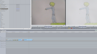
The style I chose for my animation was hand drawn with water colours - using traditional techniques to create my final piece.

To edit my animation, I began by cutting the frames up in to separate scenes so I would be able to edit them individually - I did using the scrubber and pressing "I" for the input and "O" for the out. I then placed them on to the
time line of Final Cut Pro in the correct order.

After the first short scene, it goes in to a dream sequence so to show this I used an effect called "Arithmetic," which gave it this faded, white feel and overall allowed the animation to make more sense, like so;


After doing this, I added a fade in and out at the beginning and end so the entrance and exit shots weren't so sharp. I also put one of my shorter scenes on a loop so it would continue for longer - I did this my copying the scene and pasting it next to the original clip on the time line. Like so;


Finally, I added the music. The music is something I had recorded on an acoustic guitar and cut up in Audacity. I placed it on the time line and sized it to the same size as the animation, like so;


For our new project, "The beginning of the end of," I've decided to research in to Japanese mythology and curses - since thats an area I'd want to involve. I'm still stuck between two options of Fear or Humanity, but whichever I choose I'm sure I can still use this research anyway.


Some of the films which involve curses are Ju-on, Uzumaki, Cursed, One Missed Call, The Grudge, Dark Water, Sweet Home, Tomie, Unholy Women and Shutter are a few of the Japanese curse movie's I've seen, so I'm sure I can use these in some ways.


Probably one of my main forms of research will come from Uzumaki - This is one of my favorite manga's which involves a cursed town. I love the illustrations and the messed up things Ito Junji draws.