I felt this was a good website to represent recycled goods, and showed a lot of interactivity and imagination. The first thing that caught my attention was how the landscape had been morphed in to the theme of recyling by the vegetables being used as a part of the structures - I felt this was an inventive and fitting way particulary for this type of website. I also liked how two types of style were incorperated to create a varied design - for instance, they have used a blend of real materials with images done in photoshop.
This site has various interactivity functions and all of these rely on the viewer clicking different spots on the page. I specifically liked how the animations played out by doing this, and how what was being displayed was all to do with helping the environment - so rather than making it boring and like a lecture, with loads of text about what to do to be "green," they've made it in to little animations which are far more interesting. To tie in with this, I also like how some of the landscapes move without having to click it - but others need your assistance. This allows you to feel more involved.
The main downside to this would be the loading times. It take's so long to load up the site itself, and then it's only slowed down when you finally get on the page because of all the various animations and movements - which only complicates things when you click on objects to make them animate too. Also, what was extremely annoying was when you press one of the top buttons for another page, it opens in a small box with the background still animating, so it's still painfully slow for no reason. Overal, it feels like they've tried to put too much on one page and rather than having it spread out on various other pages to make it faster, they've lumbered it all together. Also, one very important mistake was that things on the website can be missed because of the "clicking anywhere and hope something animates eventually," thing - because bluntly put, you may not press in a vital area and might miss an important animation.
However, the inspirations I found from this was how well real materials/objects can work with photoshopped ones - and how you can incorperate your theme in to anything - such as the structures using vegetables.
Tuesday, 29 September 2009
Web Design. (Recycledlifeforms.com - Research.)
Posted by Stacey-tard at 11:46 0 comments
Web Design. (Patrickbizier.com - Research.)

This website is for an Illustrator's work, so I felt it was worth including in my research because it held a lot of good and bad points.
Firstly, what drew me to the website was the hand drawn feel to the design - I loved how the Artist had used his own artwork and style to create the webpage. It made the overall feeling more about the Artist, which created a more personal feeling too it. I also liked how the background seemed to be painted on some kind of material like a book, which reflects more with what the Artist does - this, I feel, appears more effective than having a Photoshopped background or just plain colour. It gives the whole "atmosphere" on the page more feeling.
I feel this website is a fine example of how to stay intune with a specific theme throughout. Even when clicking on a link and being taken to a new page, it still has other drawings in the same style, so this shows a continuation of a styalized webpage. I feel one of the biggest mistakes is using various styles, colours and images throughout a website because it becomes messy and confusing - sticking with one theme allows it to be more professional and focused.
On the down side, there wasn't much interaction or imagination in how navigation was used - it was all pretty simple. Infact, other than the nice hand drawn imagery, the whole thing didn't really use any interesting techniques or functions. And although when you do view it, it does make you feel warm inside - almost like settling in to bed with a warm drink and a story book -, it does get boring pretty quickly because there's not much to do or access.
The main thing I want to take from this website is the classic, hand drawn feel too it. I love how it's laid out like an Art book and follows this theme throughout.
Posted by Stacey-tard at 11:00 0 comments
Thursday, 24 September 2009
Animation. (Research - Move Along.)
 For my animation project I want to create something that could be quite versatile and fit in with a certain theme. For instance, I didn't want to do a straight forward animation of me walking around and interacting with people as a portrayal of my life.
Posted by Stacey-tard at 04:14 0 comments
Friday, 18 September 2009
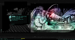
Web Design. (Nawlz.com - Research.)
 Nawlz opens in a clean, industrial style with not much imagery - but I think thats the kind of feel they wanted. To get on to different pages, you press links and it operates like a slide show, which works better than opening up another page entirely. This format also helps because it's advertising a comic book, so the sliding effect is almost like opening a page.
Posted by Stacey-tard at 07:53 0 comments
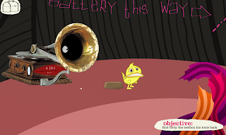
Web Design. (Bio-bak.nl - Research.)
 Bi0-bak relies mainly on it's interactivity functions, which are insanely whacky and creative. It demonstrates a nice blend of Artwork and interactions which are all done to a high standard. At times, it's almost like you're playing a game because the webpage allows you to get so involved with it.
Posted by Stacey-tard at 02:30 0 comments
Web Design. (Rolando.com - Research.)
 For my Web Design research, I wanted to look in too something which not only was "pretty" to look at, but actually has a nice interactivity which can hold an attention span for a few minutes.
Posted by Stacey-tard at 02:13 0 comments
Thursday, 17 September 2009
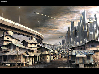
Light Wave - Research. (Futuristic City.)
 Our project for Lightwave is to design what thing's could look like in the future. It's a fairly open project with a theme thats already got stuck in my head.
Posted by Stacey-tard at 07:40 0 comments
Photography. (Early Development - Sin City.)

Well, everyone has to start somewhere. And after trying to think up a better idea for Mark's Family project, than having a load photo's representing some place I've visited or some folk I've met, I decided to go a long with some kind of other theme I could portray with the use of photo's. In the early idea stage's, I thought about some kind of comic strip style which might make the photo's more interesting and have a different way of expressing the story.
Posted by Stacey-tard at 06:54 0 comments
Influences. (Comic Books.)

Coming back to the comic book idea, I absolutely adore this style. I love the smooth pasted effect which give's off these soft blends of colour. I also love the attitude they bring with the characters, and the use of small quirks such as goggles or tattoo's to give them a more diverse character - which reminds me a lot of the Tank Girl comic books and how the artist Jamie Hewlett choses to create such intriguing characters.
Posted by Stacey-tard at 06:42 0 comments
Influences. (Sin City.)

So, I've already been influenced by the Artwork and style of Sin City. I'd love to incorporate some of it in to various aspects of my work. For instance, I love the comic book style and overall, the movie effects. I especially like the choice's they use in colour, such as using a lot of black and white's with only added bit's of colour on symbolic things.
Posted by Stacey-tard at 06:15 0 comments
Wednesday, 16 September 2009
Posted by Stacey-tard at 01:55 0 comments

