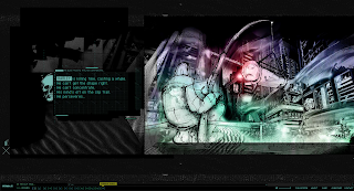
 Nawlz opens in a clean, industrial style with not much imagery - but I think thats the kind of feel they wanted. To get on to different pages, you press links and it operates like a slide show, which works better than opening up another page entirely. This format also helps because it's advertising a comic book, so the sliding effect is almost like opening a page.
The artwork is all amazingly stylized and created to a rather high standard - and the comic book, more importantly, fits with the style of the website. The various pages you can click on all have some form of interactivity and differences, so it's not like changing pages is going to be the same experience over and over. It has a lot of various functions and interactivity which is both quirky and intelligent - with how it's laid out like a comic book, how it slide's in to each page and how small animations are instigated on specific pages. Probably the main thing I like about it is how well it's laid out and how the creator has made it in his own style, which is something I'd want to do for my website. I also love the colour scheme and how it all blends well with the electric blues and pastel like purples - and their also not just standard paint but rather a nice spray paint effect.
Unfortunately, there is a lot of clicking involved to see various pages and loading time's can be demeaning. Also, the text is really small and it's obviously created for teenagers so other age groups may feel slightly alienated. But once you get passed this or this is your kind of website, hopefully you can see the real beauty in how much effort, originality and wit has gone in too it.

0 comments:
Post a Comment